Designer & Developer
Oct 2025 – Nov 2025
Gut Pop
A high-converting landing page for a playful gut-health product concept.
Project Overview
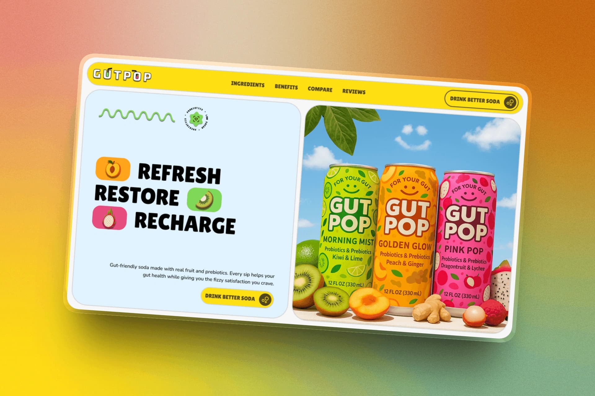
Gut Pop is a conversion-focused landing page template created for a playful gut-health beverage brand. The page was designed to quickly communicate what the product is, how it helps, and why someone should buy it.
The experience guides visitors from product discovery to one clear purchase action through strong messaging, product education, trust-building, and responsive design. I designed the interface in Figma and developed it in Webflow.
The Challenge
Gut-health products can feel clinical, complicated, or overly serious. Gut Pop needed to introduce an unfamiliar drink quickly while keeping the experience energetic, approachable, and easy to understand.
Too Clinical
Technical language and medical-looking design can make a simple beverage feel complicated or intimidating.
Too Playful
A colorful brand may attract attention but lose credibility when its product benefits are not clearly explained.
Too Much Information
Explaining ingredients, digestion, flavors, and benefits all at once can quickly overwhelm the visitor.
The challenge was balancing playful branding with clear product education. The page needed to feel memorable while explaining the drink, why its ingredients mattered, and why someone could feel confident trying it.
Research & Direction
I studied beverage brands, gut-health products, and product-led landing pages to see how they balanced a strong identity with clear benefits. The goal was to make Gut Pop feel exciting without making the product difficult to understand.
01
Market Patterns
A review of beverage branding, gut-health products, and product-led campaigns.
- Reviewed beverage packaging, flavors, and product campaigns.
- Studied how gut-health brands explained ingredients and benefits.
- Noted where brands felt too clinical or visually overwhelming.
02
Customer Needs
The page needed to answer the visitor's key product questions without slowing them down.
- Understand what Gut Pop is at a glance.
- Connect each flavor with a clear product benefit.
- Learn about ingredients without feeling overwhelmed.
03
Design Direction
These principles shaped the visual language and flow of the final page.
- A bold, playful, and product-led aesthetic.
- Bright visuals supported by a clear hierarchy.
- Short explanations that make gut health approachable.
Conversion-Focused Page Structure
The page follows a focused product journey: Hook, Educate, Build Trust, and Convert.
Bold packaging and benefit-led messaging introduce Gut Pop quickly. The following sections explain the drink, its ingredients, and its gut-health purpose before adding credibility through product details, comparisons, and social proof.
The flavors and offer then come together around one clear purchase action.
Hook
Bold packaging, a clear product promise, and one opening call to action capture attention quickly.
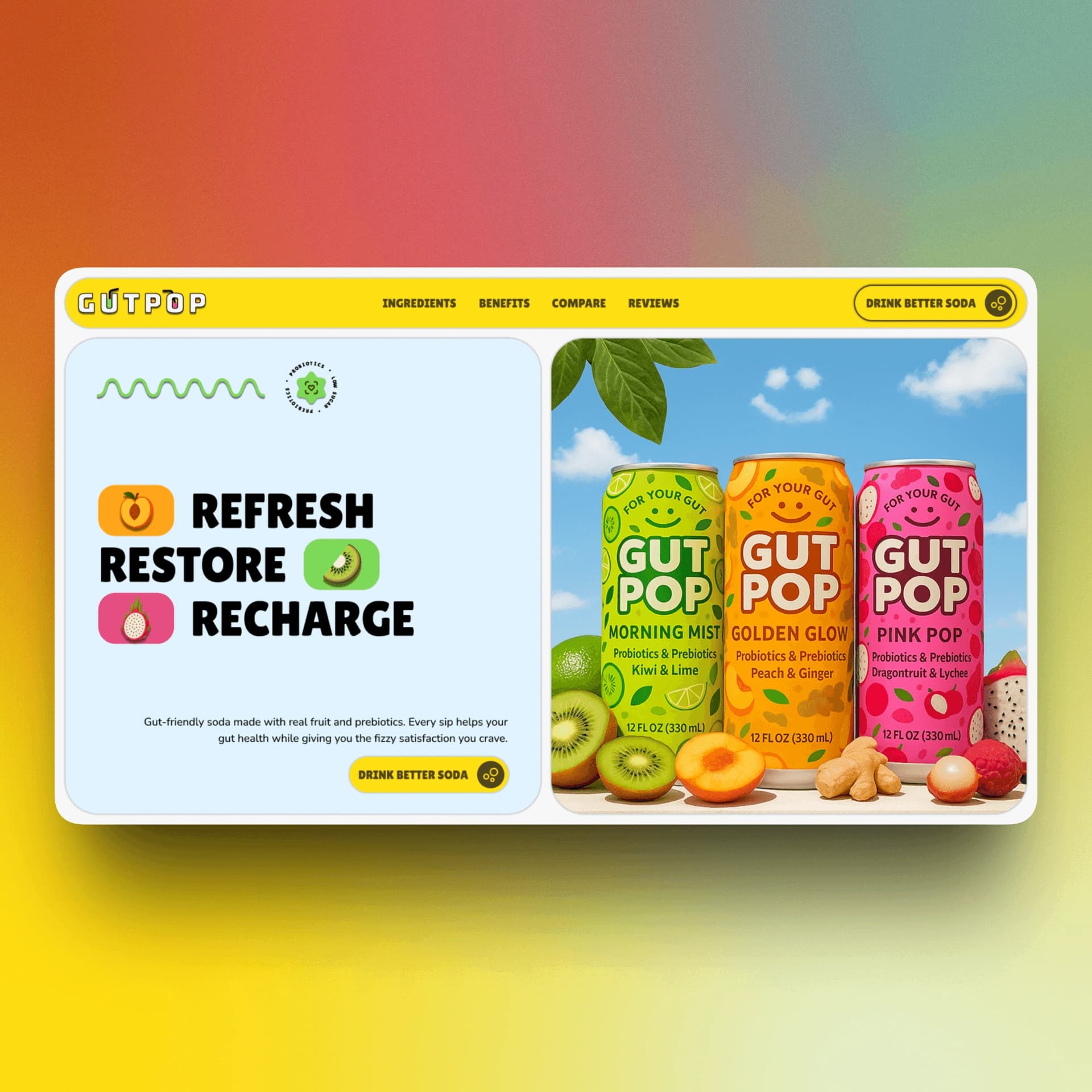
Hero section
Educate
Product benefits and ingredient details explain how the drink supports gut health.
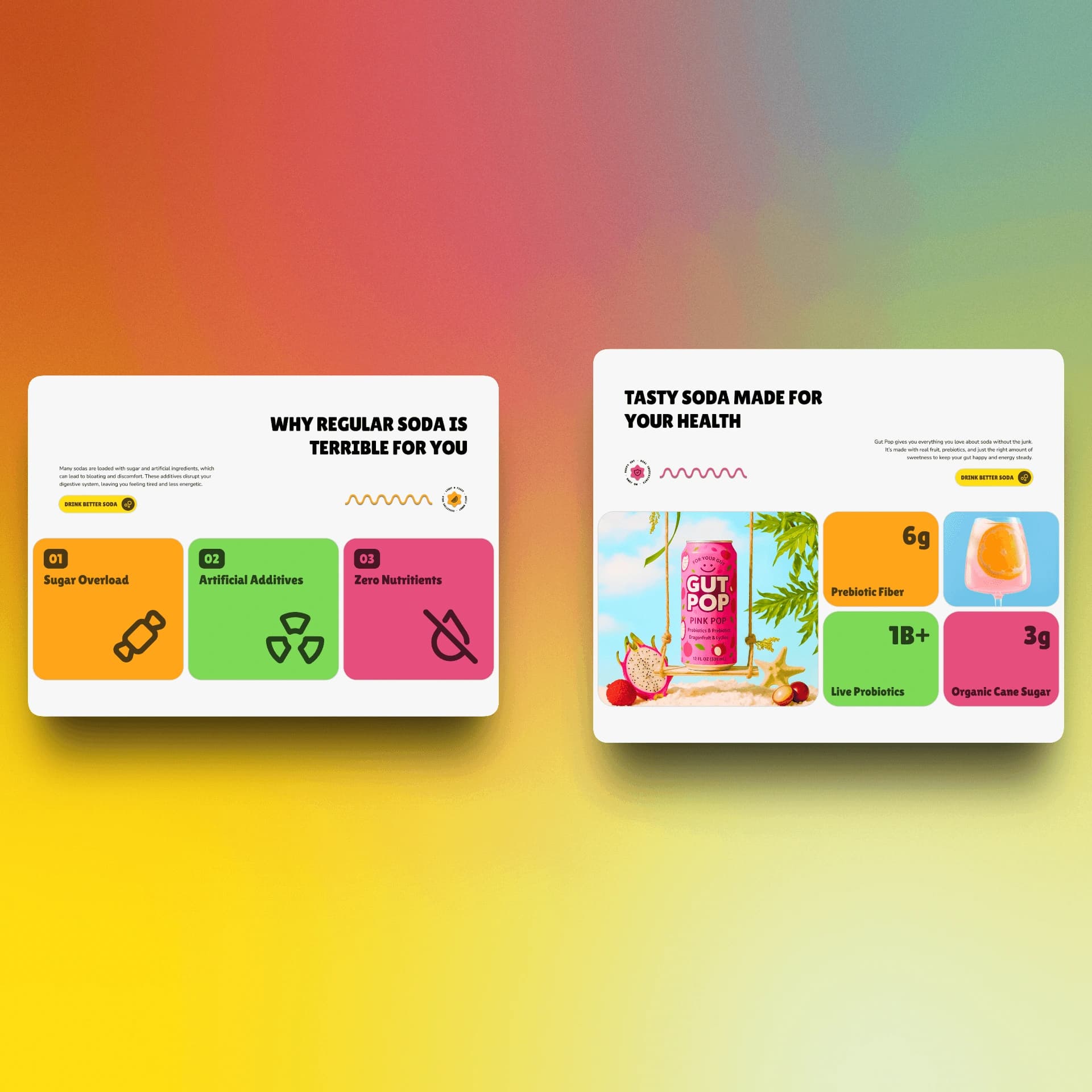
Benefits + product education
Build Trust
Clear comparisons, product claims, and social proof reduce uncertainty around the offer.
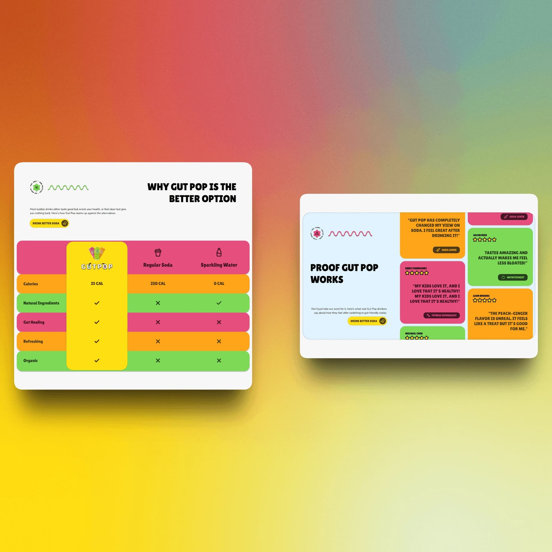
Ingredients + trust + social proof
Convert
Flavors, pack sizes, pricing, and the purchase action come together in one focused offer.
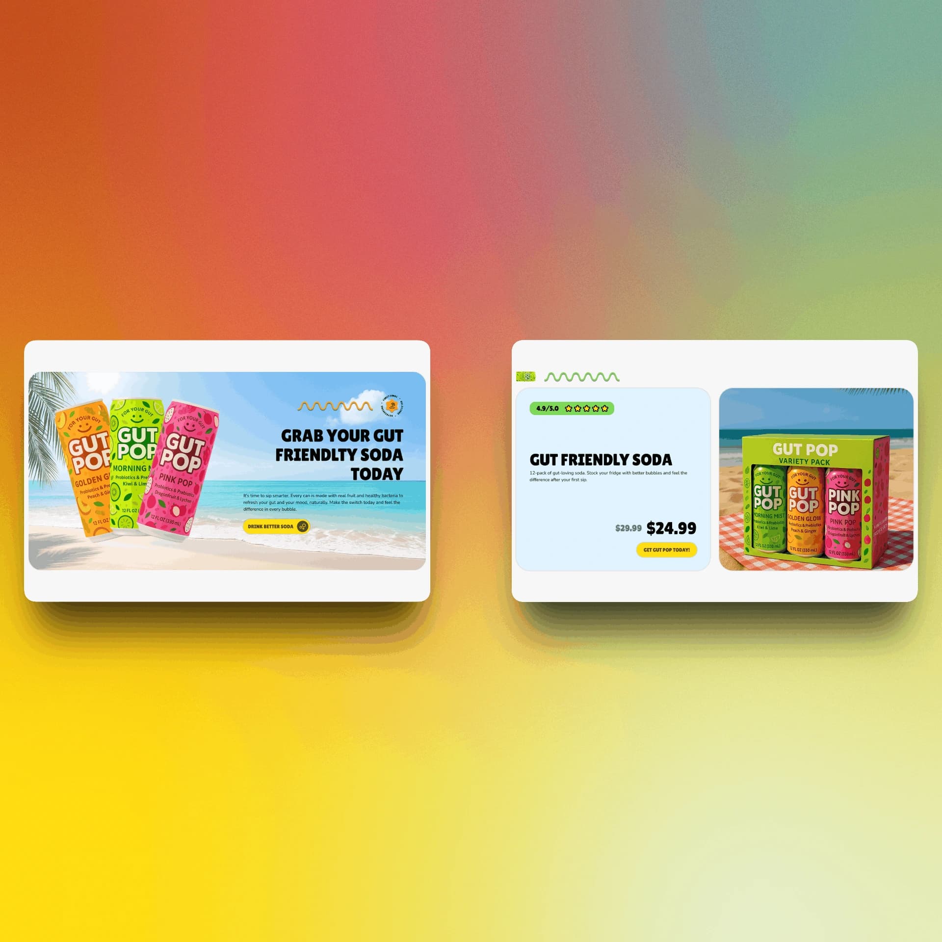
Flavors + product offer + final CTA
Visual Design System
Gut Pop's visual system grew from its colorful packaging and playful personality. The challenge was using bold color and expressive typography without sacrificing clarity or letting the interface feel chaotic.
Bright yellow, green, pink, orange, and blue distinguished the flavors, while large, confident type added energy. Simpler supporting text kept product information readable, and packaging, ingredients, and flavor imagery became central communication tools.
The final system gave Gut Pop a distinct personality while keeping its benefits and purchase path easy to follow.
Webflow Development and Component System
Gut Pop was developed in Webflow using a structured system of reusable sections, components, classes, and spacing rules. Rather than treating each part of the page as a separate one-off design, I built the layout around repeatable patterns that helped keep the experience visually consistent and easier to manage.
I used component foundations where helpful, but customized them heavily to fit the brand, content, and conversion goals of the page. Layouts, visual styles, and responsive behavior were adjusted across breakpoints so the experience remained clear and polished on desktop, tablet, and mobile.
The Webflow build was also shaped around usability. Every section needed to present information clearly, maintain a strong visual hierarchy, and make the page easy to move through without creating unnecessary friction or confusion.
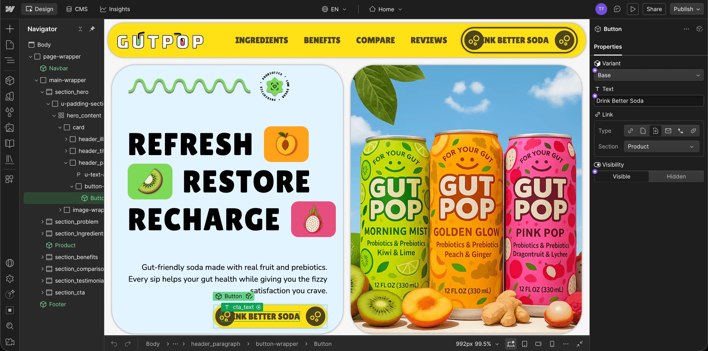
Responsive Design
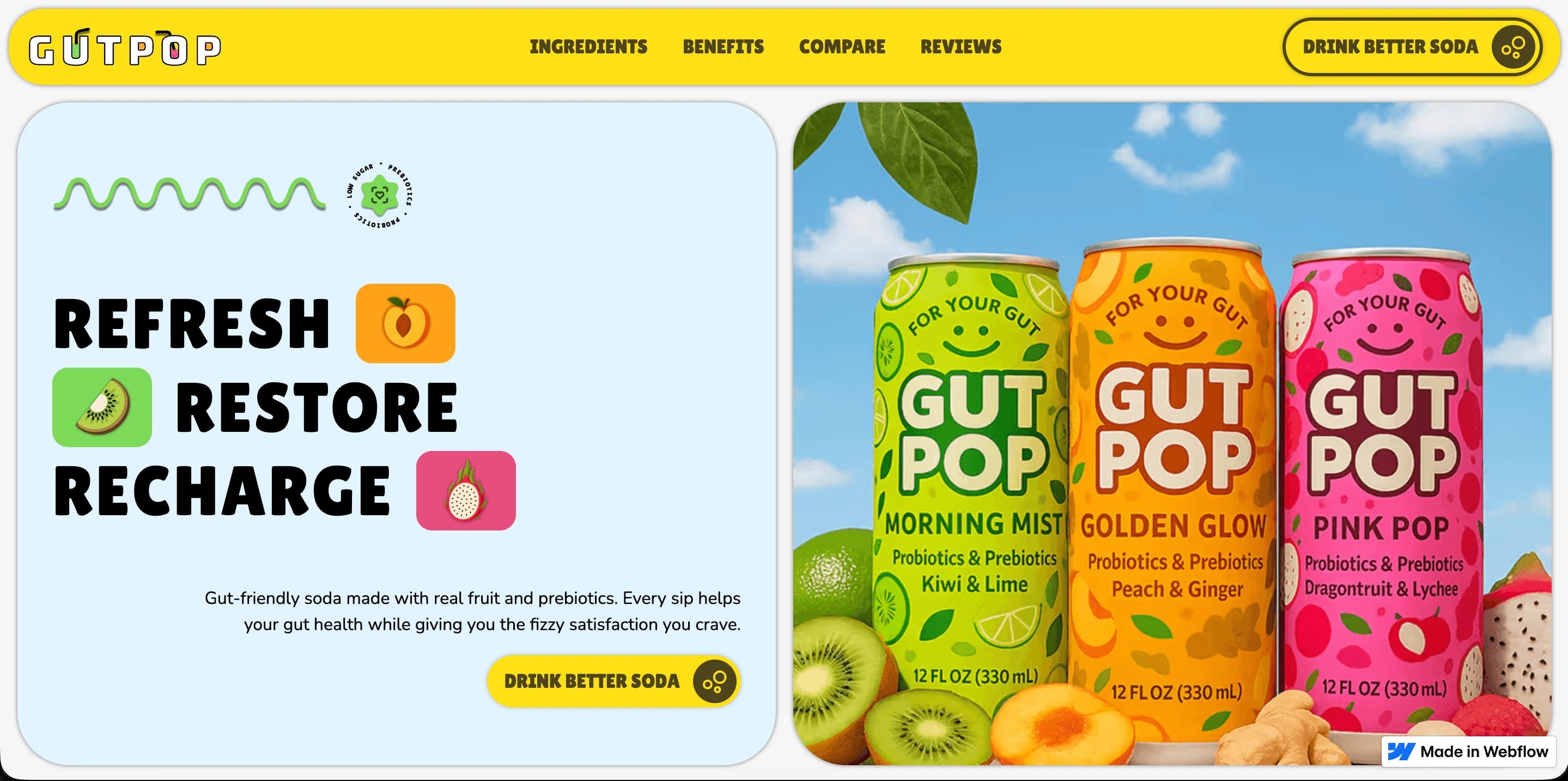
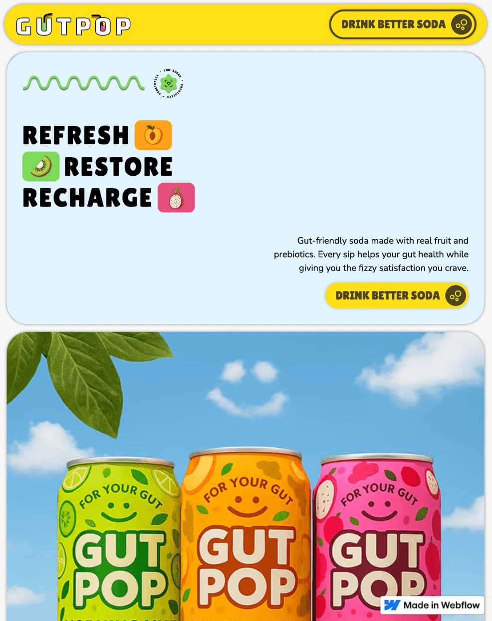
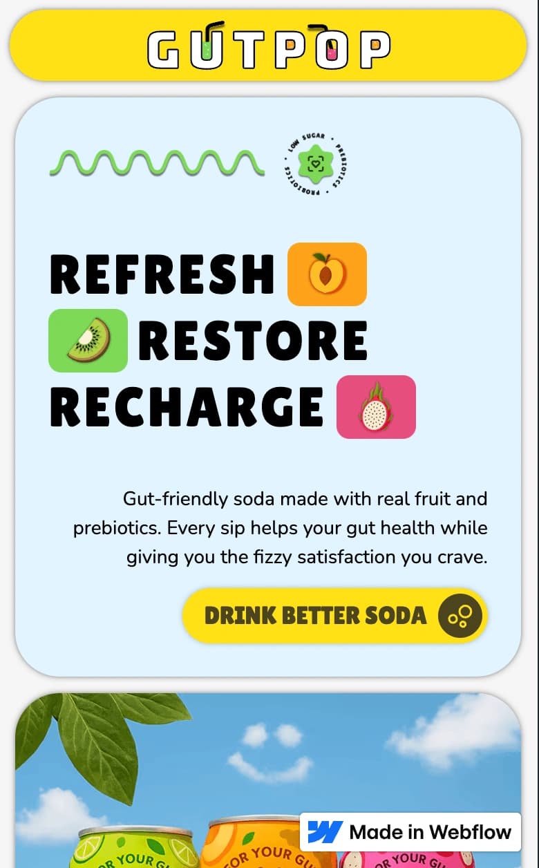
Gut Pop's responsive design preserved the desktop experience's energy without allowing bold colors, packaging, and product imagery to overwhelm smaller screens.
Packaging and flavor imagery remained prominent as widths narrowed. Colorful multi-column sections reorganized into clearer stacked layouts, preserving their intended reading order on mobile.
Headlines and product benefits were shortened or repositioned where needed so the experience kept its clarity, momentum, and product-first focus at every breakpoint.
DESKTOP — 1440 PX
TABLET — 760 PX
MOBILE — 390 PX
Marketplace Standards and Approval
Gut Pop was built as a Webflow template, but the current project files do not confirm whether it was submitted to or approved by the Webflow Marketplace. Marketplace review details must be added here before this section can make a verified approval claim.
[PLACEHOLDER: Add the Gut Pop-specific marketplace standards, submission process, and implementation details once they are confirmed.]
[PLACEHOLDER: Confirm whether Gut Pop was reviewed, approved, listed, rejected, or not submitted to the Webflow Marketplace.]
Marketplace status
[PLACEHOLDER: Add Gut Pop's verified Webflow Marketplace status.]
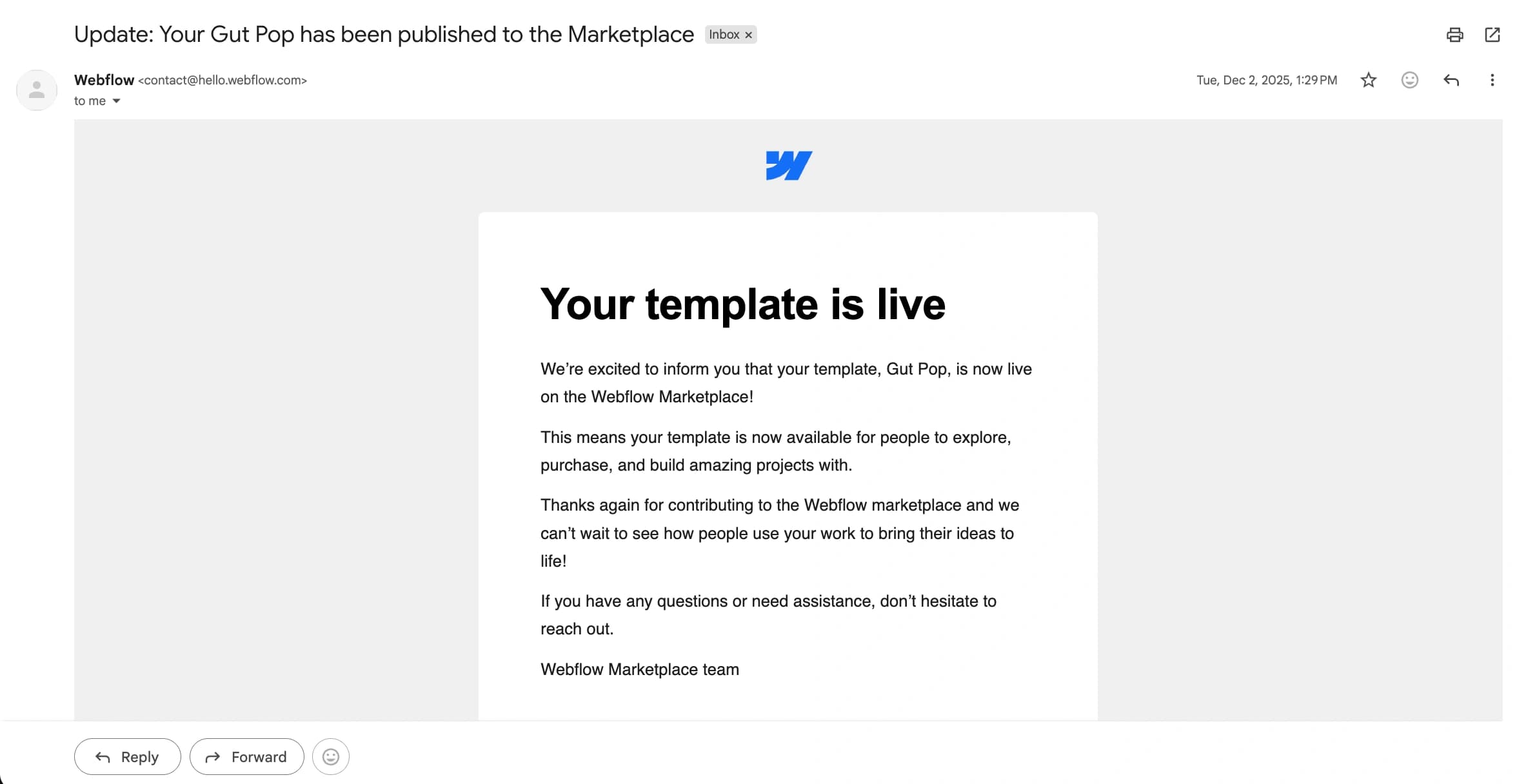
Marketplace information is intentionally unverified until supporting evidence is added.
Reference Links
Final Template Showcase
Results and Takeaways
Gut Pop strengthened my understanding of how bold branding and clear product communication can support each other.
Playful With Purpose
Bright colors and expressive visuals worked best when they also clarified flavors, ingredients, and product benefits.
Product-Led Storytelling
Packaging and product imagery became part of the page's communication system rather than serving as decoration alone.
Clarity Within Energy
Strong hierarchy, short messaging, and consistent structure kept the lively interface focused and easy to scan.
The final result combined playful brand expression, clear education, and a focused purchase journey without losing usability.
Keep exploring
Explore More Work
Continue with another project and see how each challenge shaped a different solution.