Designer & Developer
Sep 2025 – Oct 2025
Mind Matcha
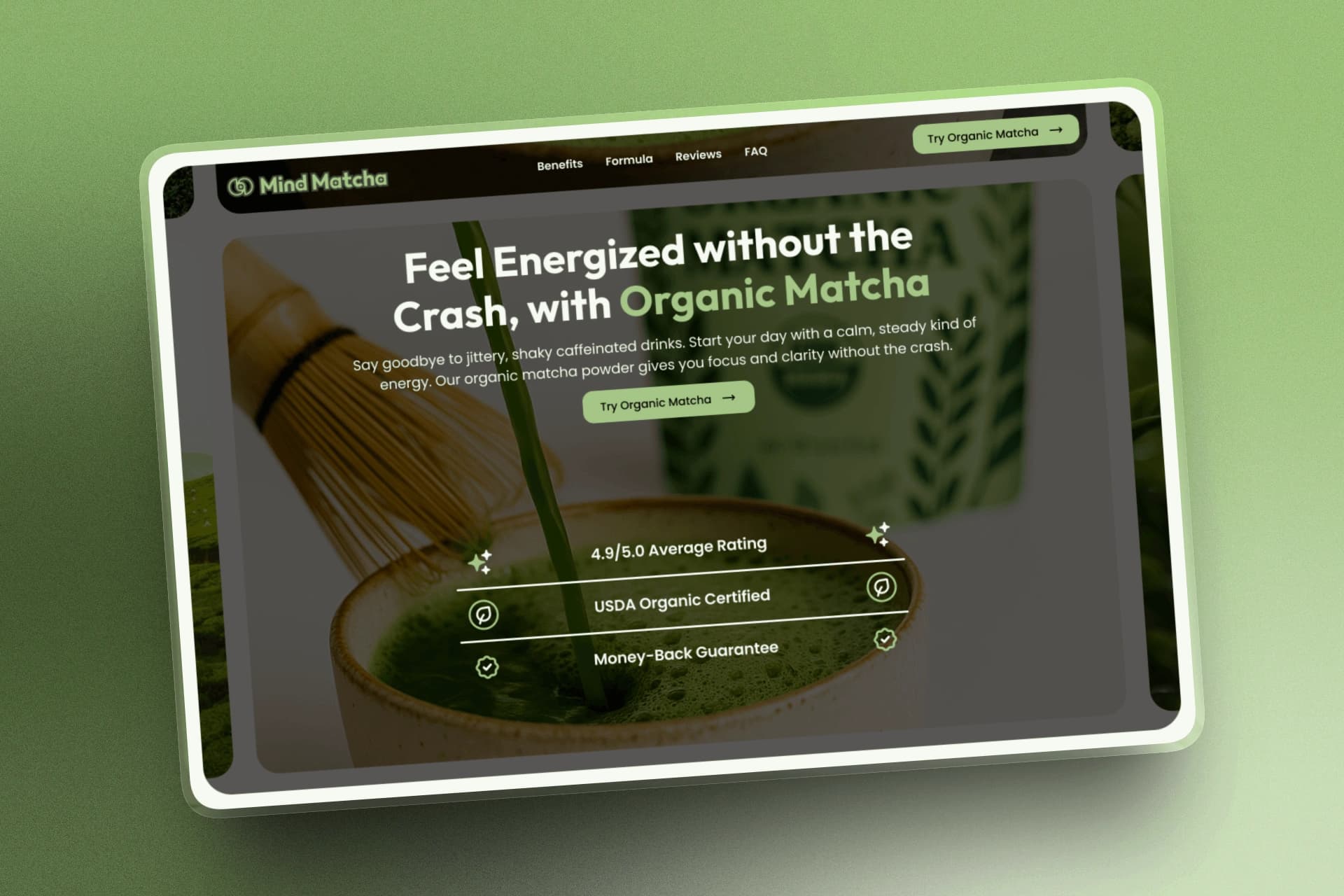
A calm, minimal landing page for a mindfulness-focused wellness brand.
Project Overview
Mind Matcha was a conversion-focused Webflow Marketplace template built as a dedicated landing page for paid campaigns.
It guided visitors from a clear product promise through education and trust-building to one direct purchase path.
The template also met Webflow standards for design quality, usability, responsive behavior, and reusable structure.
The Challenge
Many brands invest in strong ads on Meta and Google, then send visitors to generic pages that fail to continue the message or offer that earned the click.
Generic Homepage
The visitor lands on a broad website and has to search for the product or offer they originally clicked for.
Standard Product Page
The product may be visible, but the page often lacks the education and persuasion needed for visitors unfamiliar with matcha.
Poor Landing Page
Outdated visuals, weak hierarchy, or mismatched messaging can quickly reduce credibility and cause users to leave.
The challenge was creating a focused landing page that avoided these mistakes. Every section needed to continue the ad's promise, answer key questions, build trust, and move visitors toward purchasing.
Research & Direction
I reviewed wellness brands and landing-page patterns to understand how similar products introduced matcha, communicated benefits, and built trust. Those findings shaped a calm, focused direction for the experience.
01
Market Patterns
A focused review of how wellness brands introduced matcha and built trust.
- Reviewed how wellness brands introduced matcha and its benefits.
- Studied how offers, ingredients, and trust signals were presented.
- Noted patterns that felt generic, outdated, or overly clinical.
02
Customer Needs
The page needed to answer the visitor's key questions without slowing them down.
- Understand what matcha is and why it may be useful.
- See clear benefits without reading dense information.
- Feel confident in the product before purchasing.
03
Design Direction
These principles shaped the visual language and flow of the final page.
- A warm, modern wellness aesthetic.
- Clear hierarchy and concise messaging.
- A calm flow that supports education and conversion.
Conversion-Focused Page Structure
The page was structured around a focused conversion journey: Hook, Educate, Build Trust, and Convert.
Each stage answered the next question a customer was likely to have. The hero paired immediate visual appeal with a clear energy-focused benefit, then introduced matcha and how it could fit into a daily routine.
Ingredients, product benefits, reviews, and credibility signals reduced uncertainty as visitors moved down the page. A focused offer then made purchasing feel like the natural next step.
Hook
Lead with a clear energy-focused benefit and an immediate view of the product.
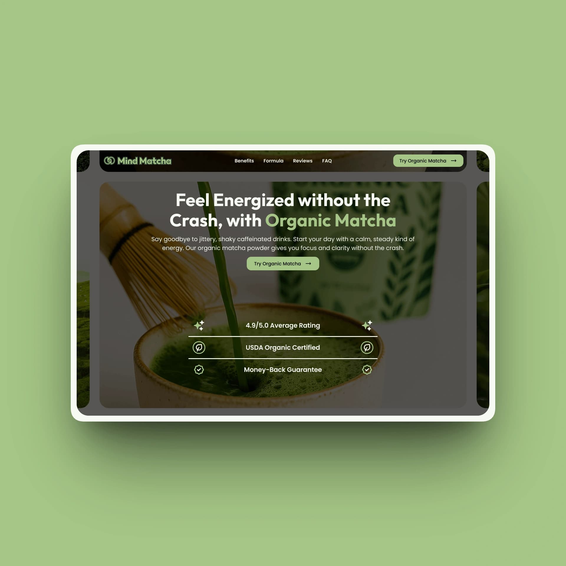
Hero section
Educate
Frame the customer problem, then explain how matcha supports a calmer daily routine.
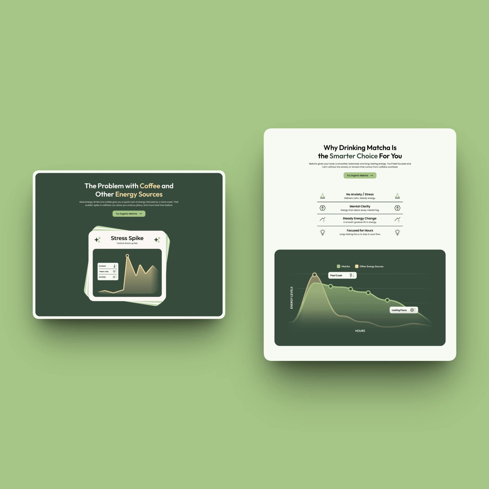
Problem + solution sections
Build Trust
Use clear benefits, customer reviews, and practical answers to reduce uncertainty.
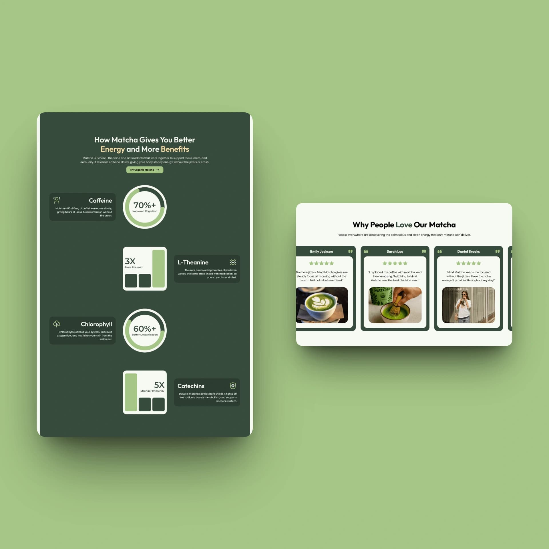
Benefits + reviews + FAQ
Convert
Bring the product offer and final call to action together around one clear next step.
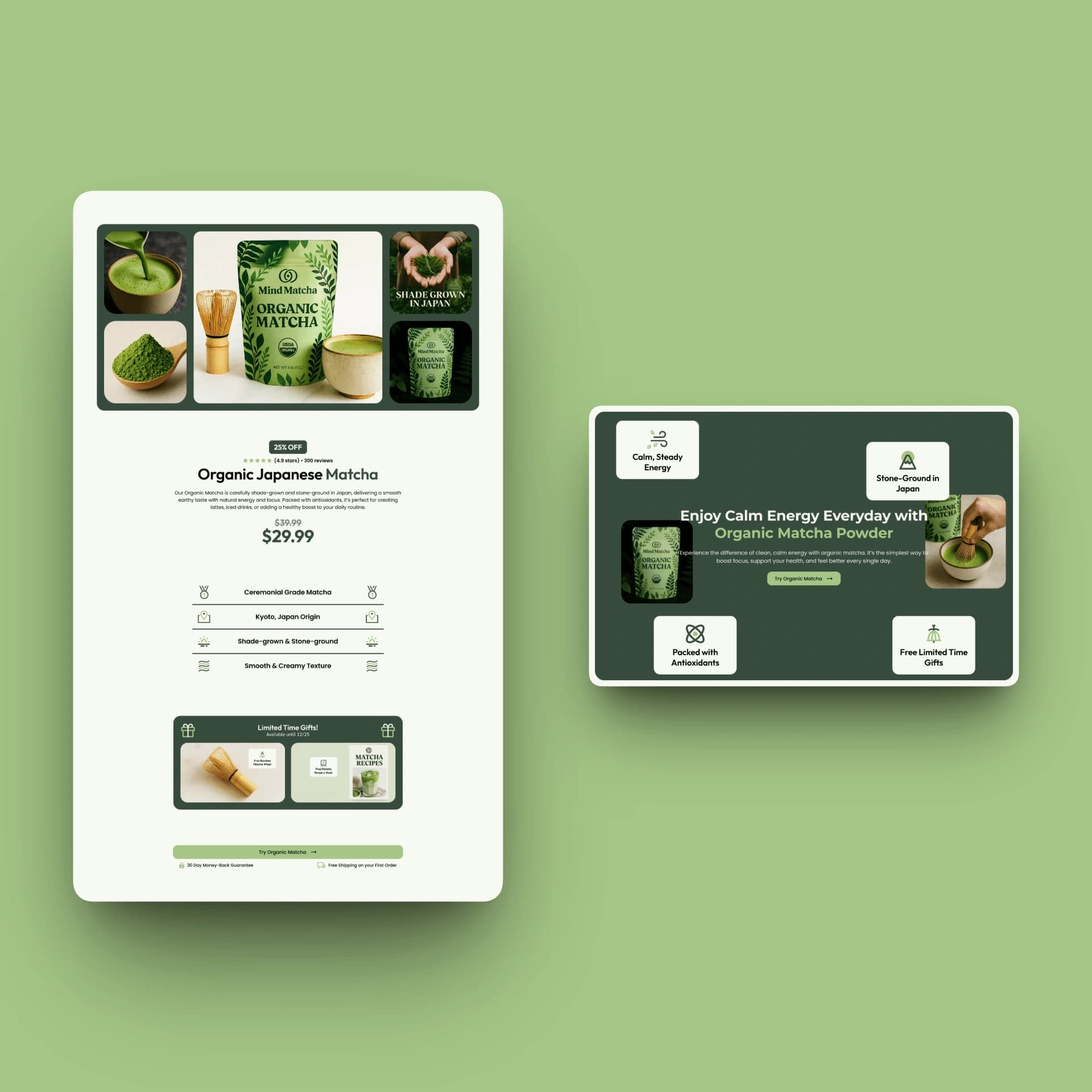
Product offer + final CTA
Visual Design System
Mind Matcha's visual system was designed to feel calm, natural, and trustworthy while retaining enough energy to support conversion. A restrained palette, clean typography, and soft visual details created a polished wellness experience.
Natural greens and neutral tones kept the interface readable, while a clear type hierarchy separated major benefits from educational details. Buttons, benefit cards, product sections, and trust elements followed consistent spacing and styling rules.
The final direction balanced wellness credibility with a modern, approachable brand experience.
Webflow Development and Component System
Mind Matcha was developed in Webflow using a structured system of reusable sections, components, classes, and spacing rules. Rather than treating each part of the page as a separate one-off design, I built the layout around repeatable patterns that helped keep the experience visually consistent and easier to manage.
I used component foundations where helpful, but customized them heavily to fit the brand, content, and conversion goals of the page. Layouts, visual styles, and responsive behavior were adjusted across breakpoints so the experience remained clear and polished on desktop, tablet, and mobile.
The Webflow build was also shaped around usability. Every section needed to present information clearly, maintain a strong visual hierarchy, and make the page easy to move through without creating unnecessary friction or confusion.
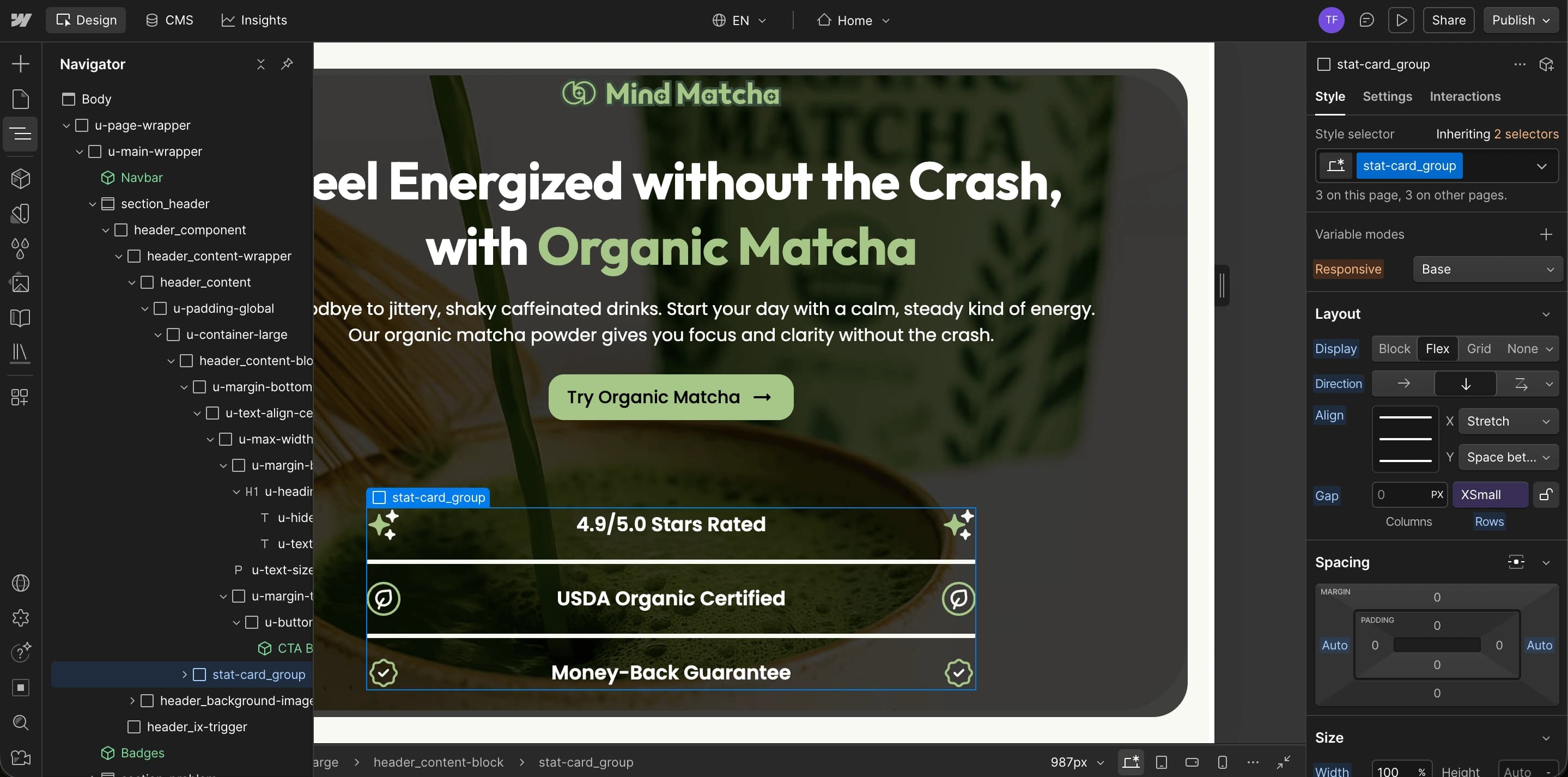
Responsive Design
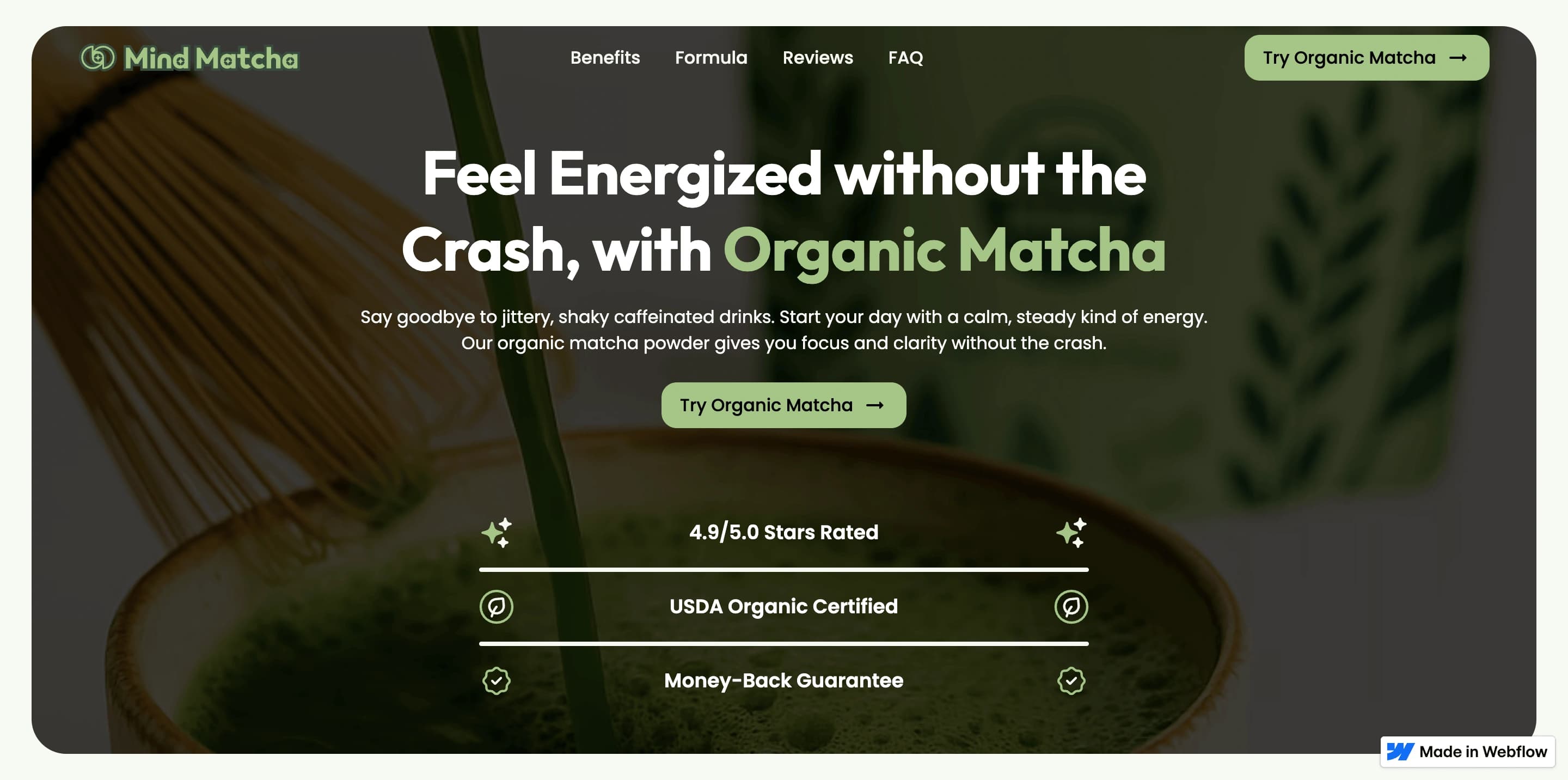
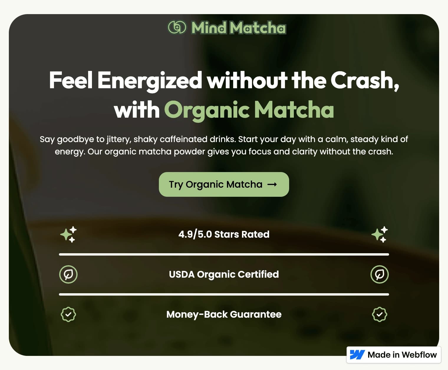
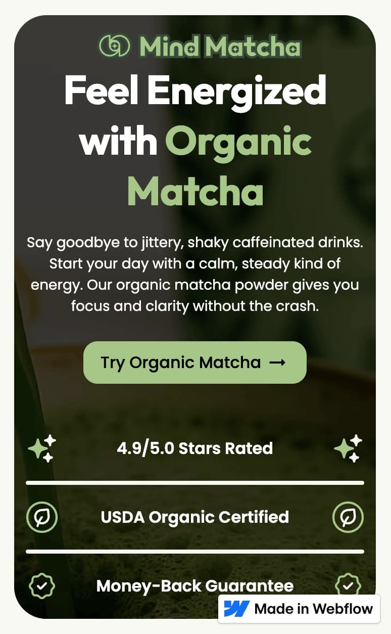
Mind Matcha's responsive system preserved its calm visual hierarchy across desktop, tablet, and mobile. Layouts were reorganized rather than simply reduced so messaging stayed clear and primary actions remained easy to find.
Headings, benefits, and calls to action maintained their relative importance as multi-column sections stacked into a clear reading order on smaller screens.
Charts, ingredient information, and supporting education remained easy to scan, keeping the restrained experience readable and balanced at every breakpoint.
DESKTOP · 1440 PX
TABLET · 760 PX
MOBILE · 390 PX
Marketplace Standards and Approval
Mind Matcha was built to meet Webflow Marketplace standards rather than functioning as an unrestricted one-off concept. The submission process required the template to pass a formal quality review and satisfy requirements covering design systems, responsive behavior, accessibility, content, assets, usability, and conversion design. Webflow's guidelines specifically emphasize reusable components, consistent styles, responsive layouts, clear navigation, visible calls to action, and sections that support the user's decision-making process.
I followed these standards throughout the project, using an organized component structure, consistent naming and spacing, resale-safe assets, responsive layouts, and a clear conversion path. I also used principles from The Webflow Way to keep the build organized, reusable, and easier for another user to understand and customize.
Mind Matcha was reviewed and approved by the Webflow Marketplace team, validating both the visual quality of the template and the structure behind it. Although the template is no longer publicly listed because I later deactivated my seller profile, the approval email provides a record of the completed review.
Marketplace approval
Mind Matcha successfully completed Webflow's template review and was approved for the Webflow Marketplace. The template is no longer publicly listed because I later deactivated my seller profile.
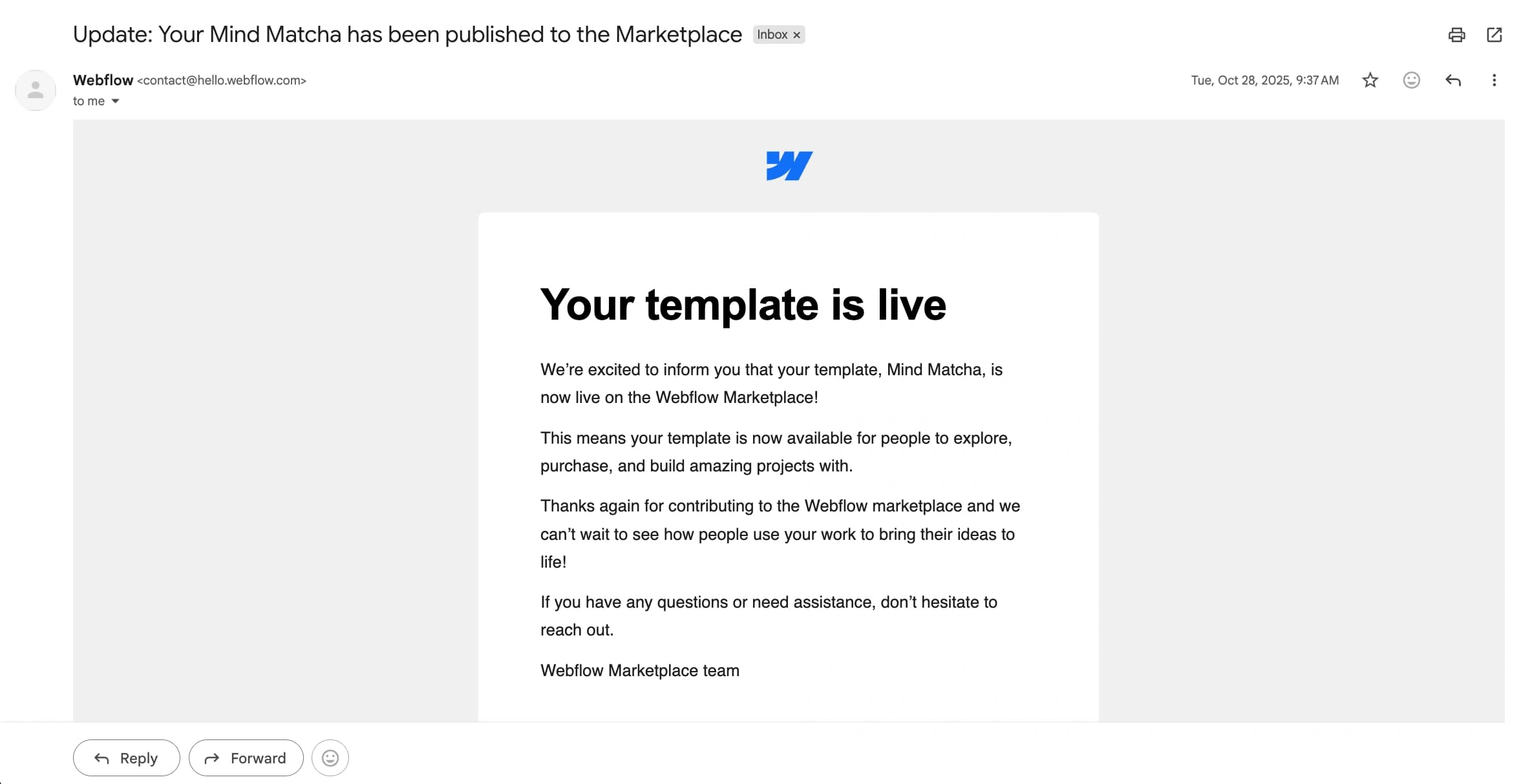
The approval email provides a record of the completed review.
Reference Links
Final Template Showcase
Results and Takeaways
Mind Matcha reinforced three principles I now carry into conversion-focused product work.
Conversion Thinking
Strong visual design also needs to guide attention, explain the product clearly, build confidence, and support the next action.
Reusable Systems
Designing for the marketplace required balancing a distinct brand identity with flexible components and layouts that future buyers could customize.
Clear Communication
The project strengthened my ability to simplify unfamiliar wellness information through hierarchy, concise messaging, charts, and visual cues.
The final result brought brand expression, usability, education, and conversion strategy into one cohesive experience.
Keep exploring
Explore More Work
Continue with another project and see how each challenge shaped a different solution.