Frontend Developer & Product Designer
Jan 2026 – Present
Macro Maxxer
Find restaurant menu items that fit your macros, without digging through the entire menu.
Project Overview
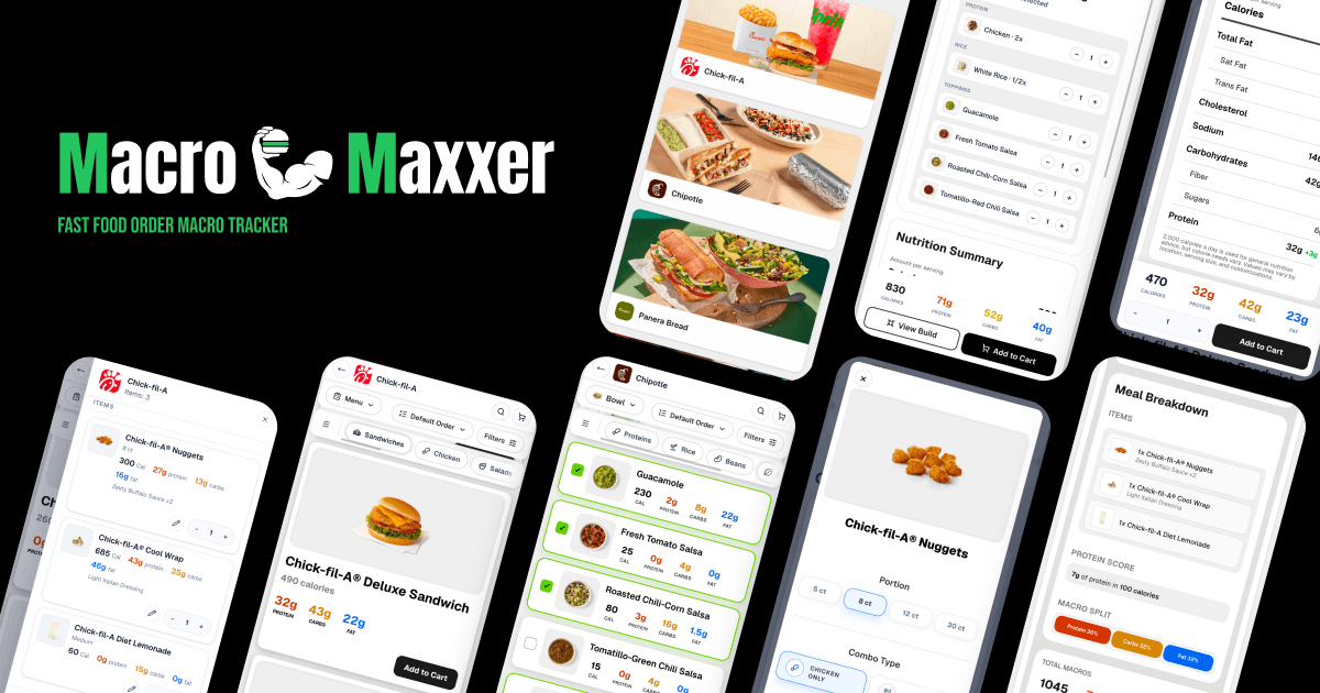
Macro Maxxer is a fast-food macro tracker that helps users see the calories and macronutrients in their order before they buy it. It makes it easier to compare menu items, customize an order, and build the best option around highest protein or lowest calorie items, or simply eating more intentionally without having to give up eating out.
Core Features:
- Searchable restaurant menus
- Macro-based sorting and filtering
- Standard and build-your-own ordering flows
- Live nutrition calculations
- Responsive desktop and mobile interface
The Problem
Fast-food nutrition information is harder to use than it should be. Finding a meal that fits a specific calorie or macro goal can turn into a long, inconsistent process with no simple way to compare everything in one place.
Information is difficult to scan
Nutrition details are often buried in crowded PDFs, inconsistent layouts, and poorly organized documents.
Comparing options takes too much effort
Users have to move between websites and inspect menu items individually instead of comparing the full menu in one place.
The final nutrition can still be unclear
Important macro details may be missing, and customizations can make the final totals difficult to predict.
Customization makes the process even harder. Removing an ingredient, changing a sauce, or adding a topping can significantly change the final calories and macros, but most restaurant websites do not make those changes easy to understand before ordering.
How It Works
Macro Maxxer simplifies eating out into four steps: search for a meal, build its structure, customize the details, and review the final results.
01
Search
Find restaurants, menu items, or meals through search and browsing.
02
Build
Choose the main item or meal structure to start your order.
03
Customize
Adjust ingredients, portions, variants, and add-ons to fit your meal.
04
Results
Review live nutrition updates and final calories and macros.
My Role & Responsibilities
As the sole designer and developer of Macro Maxxer, I was responsible for every stage of the project, from defining the product concept to designing the interface and building the application.
01/04 · PLAN
Product & Planning
Search
Build
Customize
Results
Defined the product vision and user experience, identified real nutrition-tracking needs from personal use, and scoped features around what mattered most for launch.
02/04 · DESIGN
UX/UI Design
Chick-fil-A® Deluxe
490 calories
32g
Protein
43g
Carbs
22g
Fat
Designed the core user flows, organized nutrition information into a clear hierarchy, and refined interactions to keep the experience intuitive.
03/04 · BUILD
Front-End Development
type MealCardProps = {
item: MenuItem;
onCustomize: () => void;
}
export function MealCard({ item }) {
const macros = calculateMacros(item)
return (<NutritionCard data={macros} />)
}
Chick-fil-A® Deluxe
490 calories
32g
Protein
43g
Carbs
22g
Fat
Built the application using Next.js, React, TypeScript, and Tailwind CSS, and developed responsive layouts and interactions for browsing and customizing meals.
04/04 · SCALE
Architecture & Systems
JSON menus
Shared types
Reusable components
Standard menu
Meal builder
Cart + totals
Designed a scalable data structure supporting standard and build-your-own menus, built reusable systems for adding new restaurants, and balanced flexibility with maintainability.
Target User
Macro Maxxer is designed for people who want to eat out while staying aligned with their nutrition goals. They may be tracking calories, prioritizing protein, losing weight, gaining muscle, or simply trying to make more intentional choices—but they want the process to be fast, clear, and practical.
Target User Profile
Macro-conscious diner
Wants to enjoy eating out while staying aligned with calories, macros, and long-term nutrition goals.
2–4×
Meals out / wk
Protein
Decision first
< 60 sec
Ideal choice
Primary goals
PriorityProtein
Build & recover
Calories
Stay on target
Fiber
Feel satisfied
Goal alignment
Flexible fitWeight loss
Calorie control
Muscle building
Protein targets
Everyday nutrition
Balanced choices
Eating out
Enjoyment preserved
Audience fit
Desired experience
Enjoy the meal. Trust the numbers. Stay on plan.
Current frustrations
- Nutrition information varies across restaurants.
- Comparing options requires too many steps.
- Final nutrition totals can be unclear after customization.
What they're trying to accomplish
- Build meals that fit their calorie and macro goals.
- Find high-protein options quickly.
- Understand how customizations affect nutrition.
Success looks like
“I found a meal I'm excited to eat, I know it fits my nutrition goals, and it only took me a minute to build.”
Core User Flow
The overall experience was designed to help users move from choosing a restaurant to building a complete meal with as little friction as possible. The homepage focuses on getting users into the right restaurant quickly, while the restaurant page provides the tools needed to compare menu items, customize orders, and review nutrition before making a decision.
User Journey
Choose restaurant
Select a restaurant from the homepage.
Browse & compare
Explore the menu using categories, sorting, filters, and rankings.
Standard item
Open an item and customize portions, ingredients, or add-ons.
Build-your-own
Build a meal by selecting ingredients while nutrition updates.
Add to cart
Add the completed item or build to the meal.
Review meal
See the full order and combined nutrition totals.
The flow intentionally follows a familiar restaurant ordering experience while adding nutrition-focused tools that help users make informed decisions throughout the process instead of only after placing an order.
Main Product Features
Macro Maxxer is built around a set of features that make exploring restaurant menus, comparing meals, and building macro-friendly orders faster and more intuitive than traditional restaurant websites.
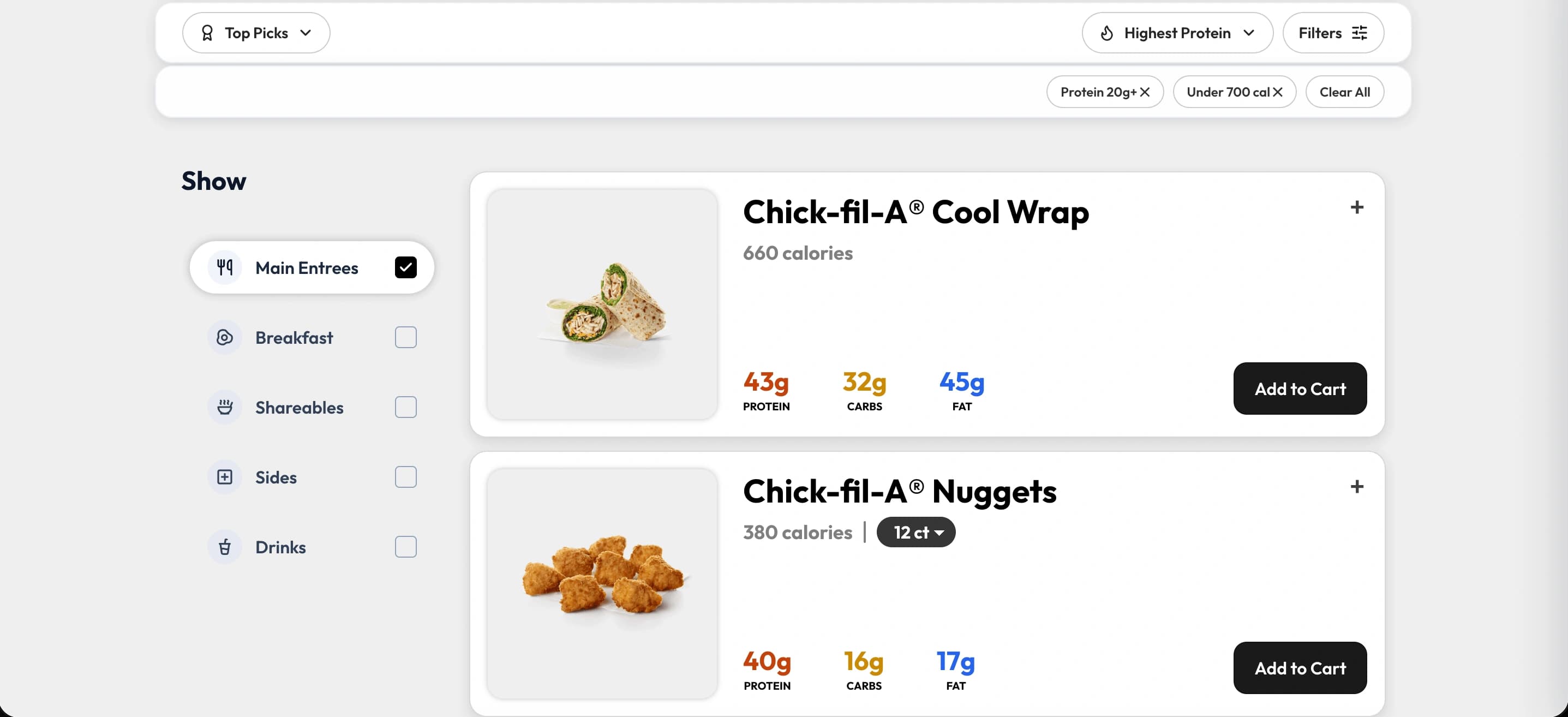
Fast restaurant discovery
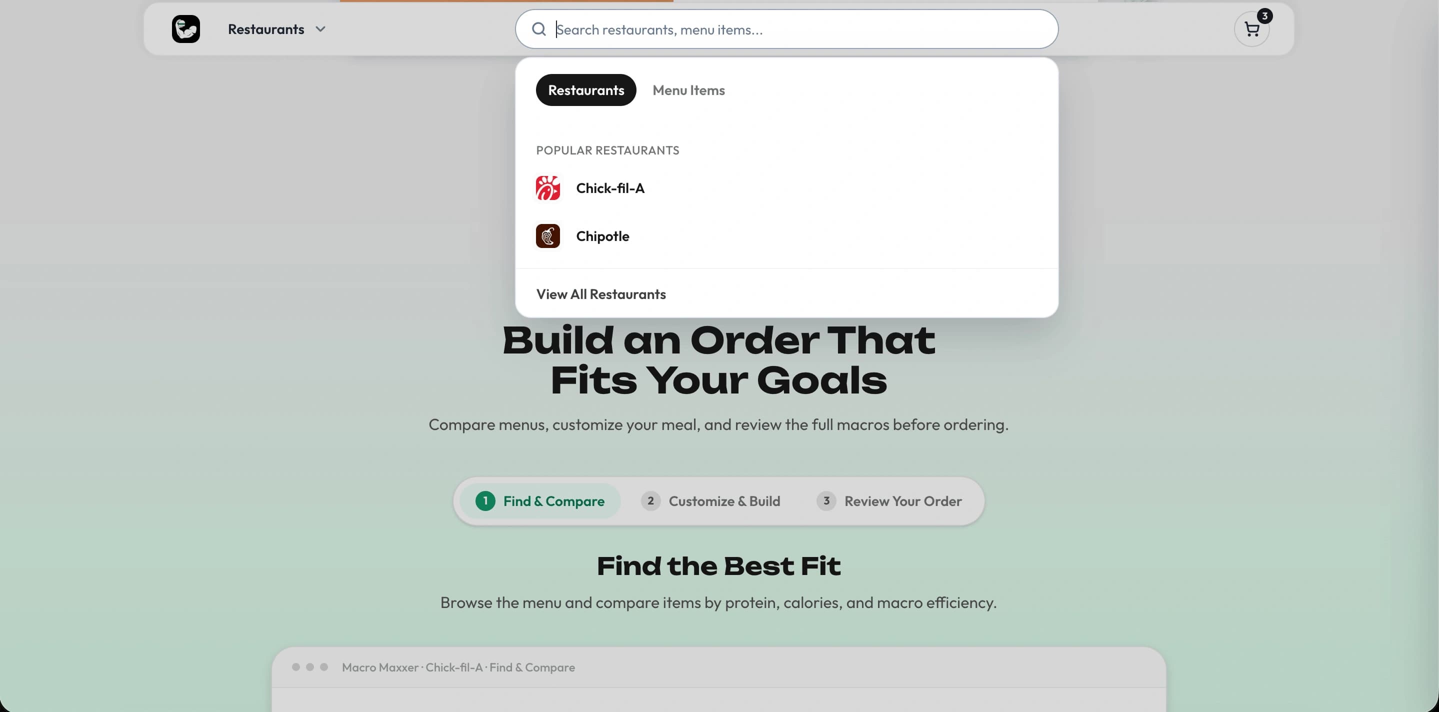
Users can quickly find a restaurant through search, browse popular options, or choose from restaurants that are known for offering macro-friendly meals. The homepage is designed to minimize friction so users can reach the menu they want as quickly as possible.
- Search
- Popular restaurants
- Restaurant recommendations
Flexible menu exploration
Instead of forcing users to scroll through a long menu, Macro Maxxer provides multiple ways to find the right meal. Users can browse categories, switch between different menu views, sort items by nutrition, and apply filters based on their goals.
- Category navigation
- Protein sorting
- Calorie filtering
- Menu rankings
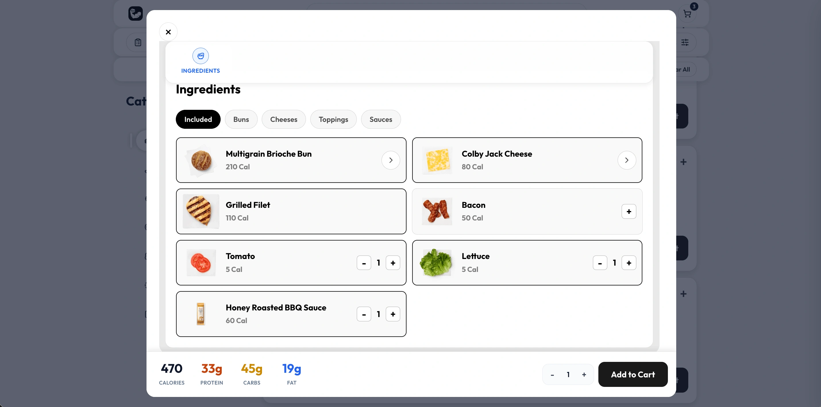
Detailed meal customization
Every menu item can be explored in more detail through an expanded view that supports ingredient customization, combo creation, and nutrition updates. Users can understand exactly how each decision affects their meal before adding it to their order.
- Ingredient controls
- Portion variants
- Add-on selection
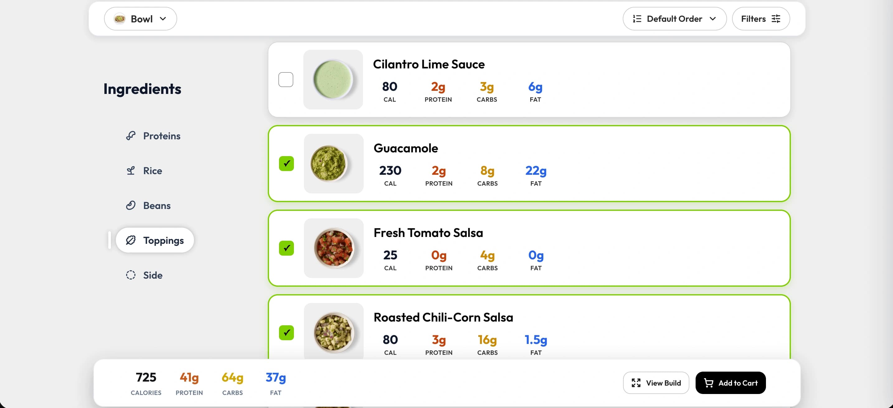
Build-your-own restaurant support
Macro Maxxer supports both traditional restaurant menus and restaurants where meals are assembled from individual ingredients. Users can build their meal step by step while always seeing an updated summary of their current order.
- Step-by-step builder
- Ingredient-based nutrition
- Sticky macro summary
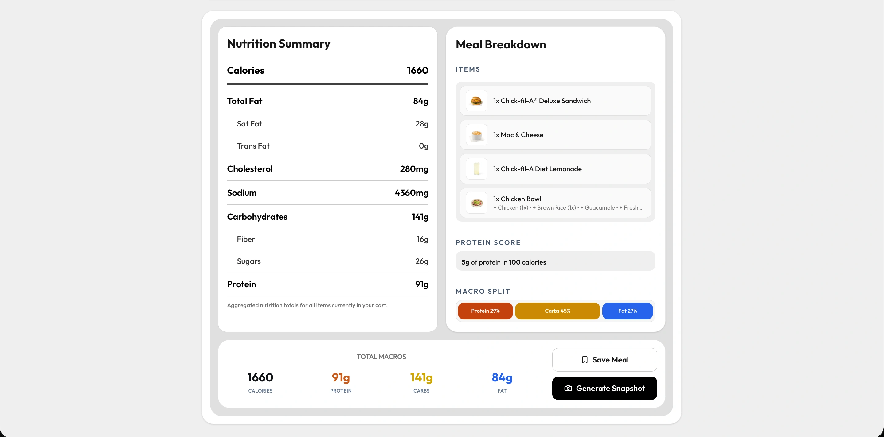
Complete meal overview
Rather than showing nutrition one item at a time, Macro Maxxer lets users review their entire order before purchasing. The final cart combines all selected items into a single nutrition summary, making it easier to understand the complete meal.
- Combined nutrition
- Meal breakdown
- Protein score
- Cart summary
Important UX Decisions
Throughout the project, I focused on reducing cognitive load and making nutrition information easy to understand without overwhelming users. Rather than adding more features, many design decisions centered around presenting complex information in a way that felt familiar, predictable, and quick to scan.
01
Prioritizing the most important information
Restaurant items contain a lot of information, so I carefully structured the card hierarchy to guide the user's attention. Images provide quick visual recognition, the item name establishes context, calories set expectations, and the macronutrients are grouped together for easy comparison. Separating calories from the macro values makes both easier to scan without competing for attention.
Result
Users can compare meals quickly without feeling overwhelmed.
Entrées
Grilled Nuggets
130 calories
25g
Protein
2g
Carbs
3g
Fat
02
Showing the impact of customizations
Customizing a meal can dramatically change its nutrition, but many restaurant websites don't clearly show what changed. Instead of only updating the totals, Macro Maxxer highlights how each customization affects calories and macros by displaying the increase or decrease alongside the updated values.
Result
Users immediately understand how their changes affect the meal instead of guessing why the numbers changed.
Customize your meal
Changes update nutrition instantly
American cheese
1 slice added
+50 cal
meal impact
Updated total
540 calories
Protein
Carbs
Fat
03
Simplifying complex restaurant types
For build-your-own restaurants, users make many small decisions that gradually create a meal. Rather than forcing users to scroll back and forth to check their totals, I added a sticky nutrition summary that updates live as ingredients are added or removed.
Result
Users can continuously monitor their meal while building it, reducing unnecessary scrolling and making experimentation much easier.
Build your bowl
Step 2 of 4 · Choose a protein
Protein choices
Brown rice
210 calChicken
180 calFajita veggies
20 calLive meal total
590 cal
P
42g
C
68g
F
18g
Standard Menus vs Build-Your-Own Restaurants
One of the biggest design challenges in Macro Maxxer was supporting two fundamentally different types of restaurant experiences within the same application.
Traditional restaurants like Chick-fil-A or McDonald's are built around predefined menu items. Users simply choose an item, make a few optional customizations, and add it to their order.
Build-your-own restaurants, such as Chipotle or MOD Pizza, work very differently. Instead of selecting a finished item, users create their meal step by step by choosing ingredients from different categories like bases, proteins, toppings, and sauces. Because every combination is unique, a system based on predefined meals wouldn't provide the flexibility users expect.
UX Challenges
Standard menus
Large item cards work well because each card represents a complete meal.
Build-your-own menus
The same pattern becomes overwhelming when users must choose from many individual ingredients, so the interface needs a more compact builder.
Technical Approach
Shared system
Both restaurant types use the same overall architecture and reusable components.
Restaurant-specific behavior
Required ingredients, category limits, included items, and customization rules are controlled through structured restaurant data rather than duplicated code.
Reusable Components and Data Structure
Macro Maxxer is built around reusable components and a data-driven architecture, so the same interface can adapt to very different restaurant types without duplicating work.
Reusable components
Menu cards, nutrition summaries, filters, and the cart are shared across every restaurant, keeping the experience consistent.
Data-driven restaurant behavior
Each restaurant's menu, ingredients, and rules come from its own data, which determines whether it uses a standard menu or a build-your-own experience.
Easier expansion
Adding a new restaurant is mostly a matter of adding its data instead of rebuilding the interface from scratch.
Restaurant Data
Shared Components
Menu Cards
Filters
Nutrition Summaries
Cart
Standard Menus + Build-Your-Own Menus
Responsive Design
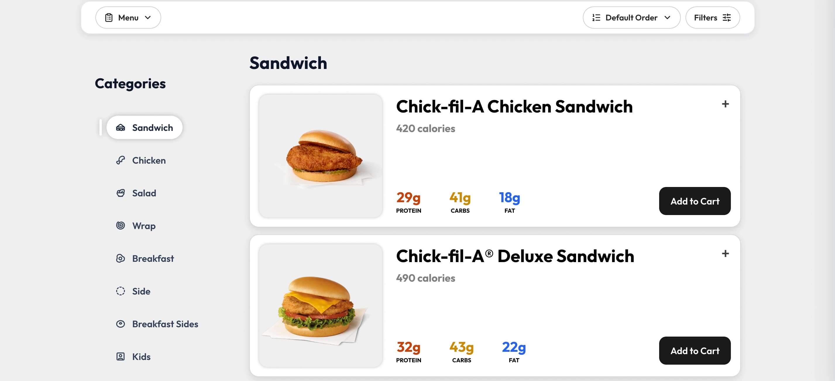
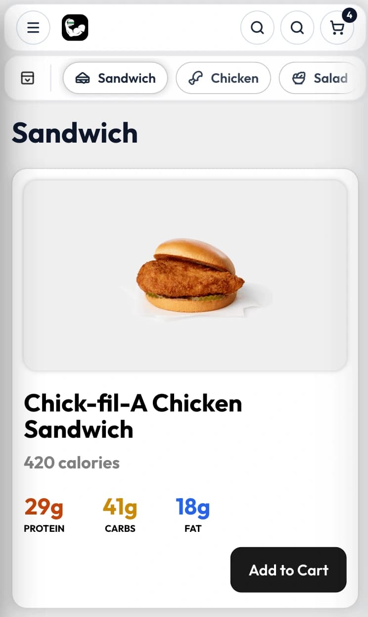
Macro Maxxer was designed to work across desktop and mobile without removing any core functionality. Rather than creating two different experiences, the goal was to adapt the layout so it stayed clear, usable, and easy to navigate on smaller screens.
01Navigation
Desktop keeps sorting, filters, and view controls visible, while mobile groups them into a compact menu to save space.
02Category browsing
The desktop category sidebar is replaced on mobile with a horizontally scrollable navigation so users can jump between sections without losing screen space.
03Complex screens
Detailed item views and build-your-own flows are reorganized vertically on smaller screens so nutrition, customization, and review panels remain readable and easy to use.
Result
The full product experience stays available across screen sizes without making mobile feel crowded.
Main Challenges and Solutions
Macro Maxxer taught me a lot beyond just writing code. Looking back, most of the biggest lessons came from mistakes I made early in the project.
01
Designing for scalability
Challenge
Early in the project, I was mainly focused on getting features working. As the app grew, I realized some of those early decisions did not scale well and made future changes harder than they needed to be.
Solution
That experience pushed me to think more carefully about the system before implementation. I started planning shared structures earlier, especially for features I knew would expand over time.
02
Using AI effectively
Challenge
Another challenge was learning how to use AI effectively during development. At first, I leaned on it too heavily, which sometimes produced code that worked but did not fit the structure of the project.
Solution
Over time, I learned that AI is most valuable as a tool for speeding up development and brainstorming, not as something that should make every decision for me. I became more intentional about reviewing, adapting, and guiding what it produced.
Lessons Learned
01
Complete feature development lifecycle
I learned that adding a feature involves much more than writing code. A stronger process starts by defining the problem clearly, planning the experience and technical impact, building within the existing system, and then validating the work before release and iteration.
Define
Problem · Requirements · Criteria
Design
Flow · UI states · Data · State
Build
Logic · Components · Implementation
Validate
Testing · Edge cases · Review
Ship
Pull request · Release · Iterate
02
Solve real problems
I stopped judging features by whether they were interesting to build and started asking whether they genuinely improved the user experience.
03
Plan the system earlier
More upfront thinking around architecture, scalability, and documentation would have made later development smoother.
04
Build for the user
The biggest lesson was that strong software is not just about adding features—it is about building the right features clearly and intentionally.
Future Improvements
Macro Maxxer already covers the main experience of finding, comparing, customizing, and building meals, but there are still several ways I would like to expand it.
User accounts
Users could favorite menu items, save completed meals, and access a personal dashboard with previous orders and saved combinations.
Map and nearby restaurants
Users could find nearby restaurants and compare options based on what is actually available around them.
Stronger data validation
A more reliable process for checking nutrition data, filling in missing public information, and keeping restaurant menus accurate over time.
These additions would make Macro Maxxer feel more personal, more useful in everyday situations, and easier to rely on long term.
Keep exploring
Explore More Work
Continue with another project and see how each challenge shaped a different solution.